Once in a lifetime? - 3rd quarter, 2023
“History never repeats itself, but it does often rhyme” – Mark Twain
I’ve always been a curious person and like learning about new things. There’s always some new widget or technology that’s going to dramatically impact our lives, but investors must also think about how the future will play out if they want an opportunity to capitalize on those changes. Fortunes will be made for some companies and lost by others. While we can’t predict what will happen, sometimes it helps to look to the past and see how previous technology changes affected both challengers and incumbents.
Today’s headlines often focus on electric vehicles and artificial intelligence, but yesteryear it was canals, railroads, telegraphs and airplanes. When investors look at these past developments, it’s like reading a spoiler-filled Wikipedia entry – they get a clinical understanding of the major plot points but miss out on the real-time emotions that people were experiencing back then. These behavioural elements are what sway the market between greed and fear, bull and bear markets, and bubbles and panics. These elements also allow investors to take advantage of mis-pricings when they see something the market doesn’t.
Depending on the type of investor you are, you’ll look for different things. Think of this as pattern recognition. Some readily available information like economic data points (e.g., monthly GDP or quarterly earnings reports) occur frequently, so investors will have lots of experience with them and can react accordingly. Other events occur so infrequently that investors might be the proverbial “deer in headlights” – they don’t know what to do because they’ve never seen it before. Studying market history can help us learn from anomalies that might arise a couple of times over an investor’s 40-year career, and importantly, have a plan when the real thing happens.
Dim bulbs
One famous bubble was the Dutch Tulips phenomenon in the 1630s, where investors (a.k.a., speculators) bid up the prices of these flowers to ever-more-irrational levels. Some rare tulips even cost more than a house, before prices just as quickly collapsed. Tulip-mania stands as one of the greatest bubbles of all time, widely regarded as so irrational that it wouldn’t occur again…well, at least until a few years ago.
NFTs, short for “non-fungible tokens,” are blockchain-based tokens that represent a unique asset like a piece of art, digital content or media. Think of them like certificates of ownership and authenticity for something digital. Tech entrepreneur Jack Dorsey auctioned his first tweet as an NFT in 2021 and it sold for US$2.9 million.i What’s a tweet you ask? It’s defined as a post made on the social media platform X (formerly known as Twitter); it’s also the chirping sound of a small bird.

Source: Sina Estavi, NFT owner.
A year later, the new owner listed said NFT tweet for only US$48 million, which maybe surprisingly didn’t sell. It was re-listed a second time where the highest bid received was US$6,800 and again didn’t sell. The third time it was re-listed, the top bid was US$277 and again it didn’t sell. Most recently the best current bid is US$3.77. It has been reported in the media that 95% of all NFTs are currently worthless.ii I said earlier that there wouldn’t be another Tulip-mania, but we came pretty darn close this time, and it only took about 400 years.
The current example affecting most people is the return of inflation. The last time it was this high was in the 1970s, and before that the 1940s. Interest rates in both Canada and the U.S. have been on a downward trend for most of the last 40 years. Now the pendulum has reversed as rates have been rising, with both the largest and fastest increases since disco was popular.
Rolling 1-year Canadian inflation
Dec. 31, 1939 to Aug. 31, 2023
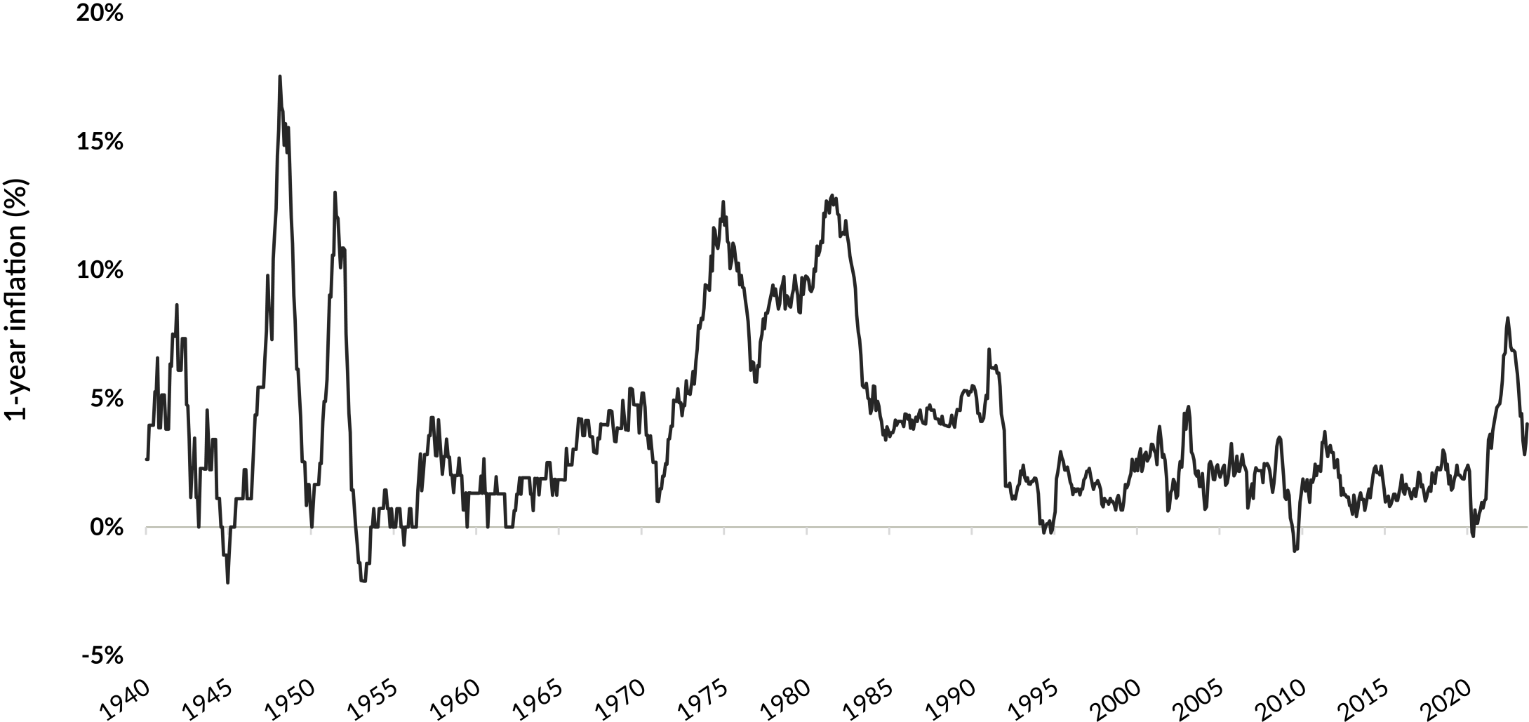
Source: Statistics Canada. Table 18-10-0004-01 Consumer Price Index, monthly, not seasonally adjusted. As at August 31, 2023. Inflation was calculated based on 1-year change of the Canadian Consumer Price Index.
There are follow-on consequences such as the effect higher rates have on the three main asset classes: bonds, stocks and real estate. The problem is most investors today weren’t active back in the 1970s and don’t have real-world experience investing through an environment as we’re in today. Unfortunately, the same can be said for central bankers and politicians.
The bigger they are, the harder they fall?
Looking at the companies can be even more informative. Specifically, investors are often attracted to companies that share certain traits, such as oil & gas in the 1970s or Japanese firms in the 1980s. There’s an appeal to investing alongside the crowd, but popularity usually comes at the cost of high-priced shares. The higher the valuation today usually means lower returns down the road as the future returns have been pulled forward. Japan was one of the best-performing markets in the 1980s, yet its stock market remains below its 1990 peak. Imagine being a Japanese investor and you’ve made minimal returns for over 30 years!
Just like inflation made a comeback, the market seems to have rallied again around tech stocks. We’ve seen a partial deflating of the money-losing companies that were viewed as disruptors at the onset of COVID-19 (think WeWork and Peloton), and that’s now morphed into the “Magnificent Seven” (Apple, Microsoft, Amazon, Alphabet (Google’s parent), Tesla, Nvidia and Meta). While these businesses are household names, investors buying them today are paying an average of 32x forward earnings.iii The last time tech was as popular as today was in the 1990s. A few of the bellwether stocks from back then would be Cisco and Intel, both of which trade at lower prices today than in 2000, even though both companies continued to grow.
Something else happening in the market that’s received significantly less attention is the growing valuation disconnect between smaller and larger market-cap companies. As more money managers have gravitated towards owning the largest companies to minimize their tracking error (risk of underperforming the index), there’s been less focus towards the mid-cap space. Many of these companies are well established with long track records and dominant positions in their respective markets.
The following graph compares the relative valuation of the S&P 400 Index (which is considered the U.S. mid-cap index) against the S&P 100 Index (the 100 largest companies in the U.S.). It’s an average of five different valuation factors. A value greater than 100 means mid-caps are trading at higher or more expensive valuations against large caps, while below 100 means they’re less expensive on a relative basis.
S&P MidCap 400 Index vs. S&P 100 Index relative valuations (average)
Dec. 31, 1999 to Sep. 30, 2023
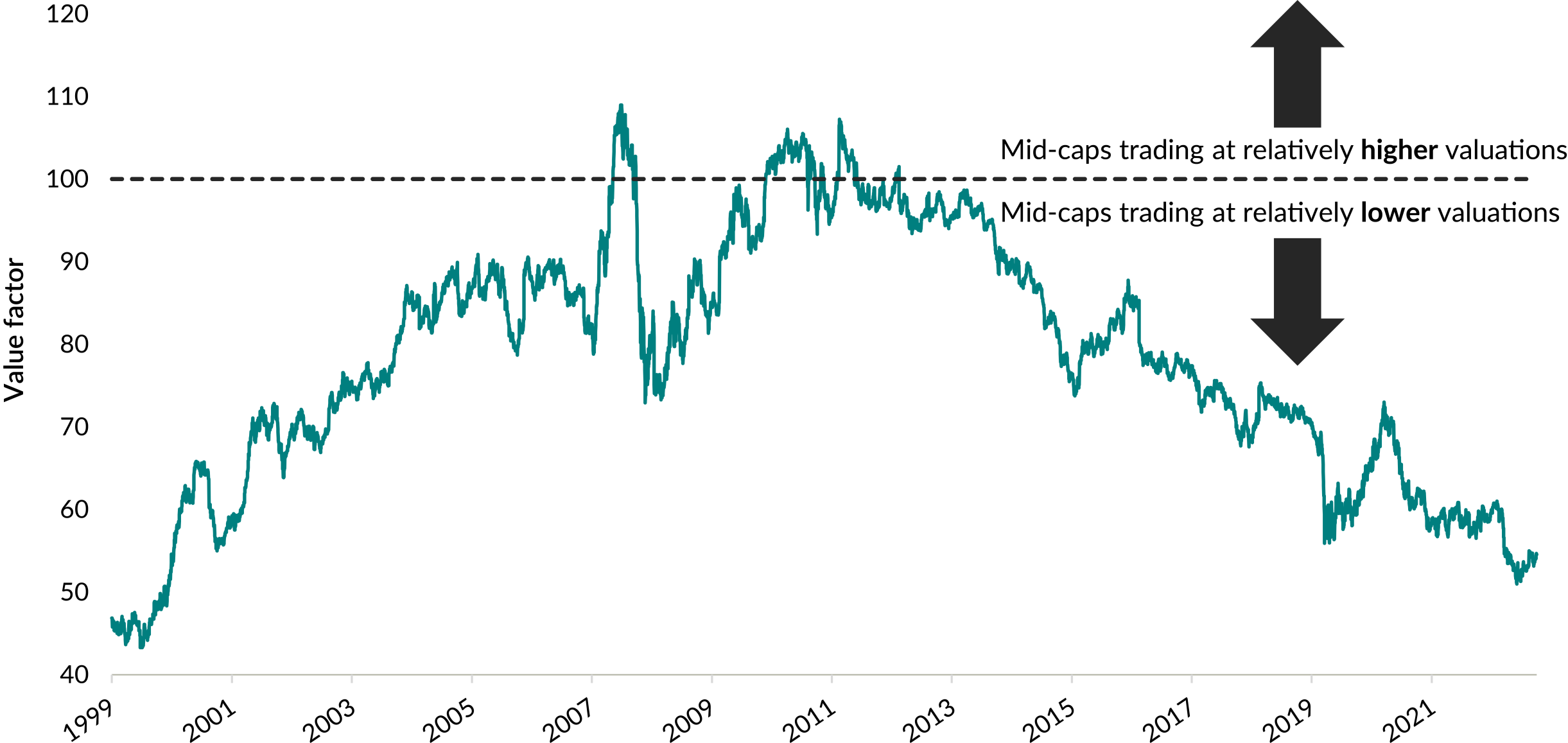
Source: FactSet Research Inc. The S&P 100 Index is composed of the 100 largest U.S. companies based on market capitalization. The S&P MidCap 400 Index is composed of the mid-range 400 U.S. companies based on market capitalization. The indexes are not investible. Relative valuations are the daily average of five valuation metrics for the two indexes: price-to-earnings ratio, price-to-book value ratio, price-to-cash flow ratio, price-to-sales ratio and enterprise value-to-earnings before interest, taxes, depreciation and amortization.
The data shows that, on average across these five valuation metrics, mid-caps are trading at approximately a 45% valuation discount relative to the largest 100 companies in the U.S., and they’ve been de-rated from a peak of over 100% since circa 2011. The last time mid-caps traded at such large valuation discounts was over 20 years ago, roughly when Geoff MacDonald and I were co-lead portfolio managers on a mid-cap focused Global Endeavour fund. Historically, mid-caps trade at similar or higher valuations than large caps because they’re smaller sized and have a longer growth runway.
So, what happened to those willing to look different the last time conditions were similar to today? For the first 13 years after the end of the dot-com boom in 2000, the large-cap index was flat while mid-caps more than tripled. That outperformance has continued over the next decade, right to today.
S&P MidCap 400 Index vs. S&P 100 Index – Growth of US$100
Dec. 31, 1999 to Sep. 30, 2023
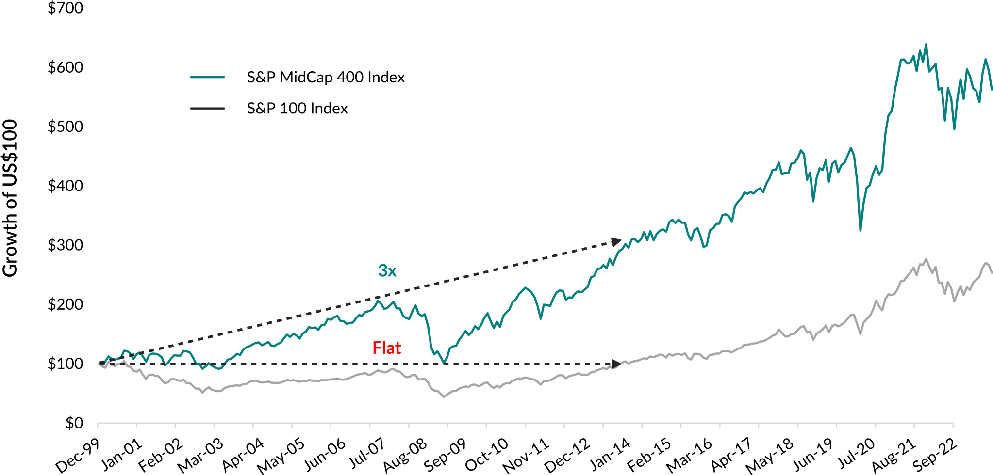
Source: FactSet Research Systems Inc. Index price return in US$.
We’ve talked before about lost decades in the stock market where markets are flat for prolonged periods of time. With inflation running at 30-year highs and purchasing power of your assets going down as a result of inflation, can anyone afford flat performance for the next decade?
Growth of $1 in real terms of a traditional 60/40 balanced portfolio
1900 to Sep. 2020
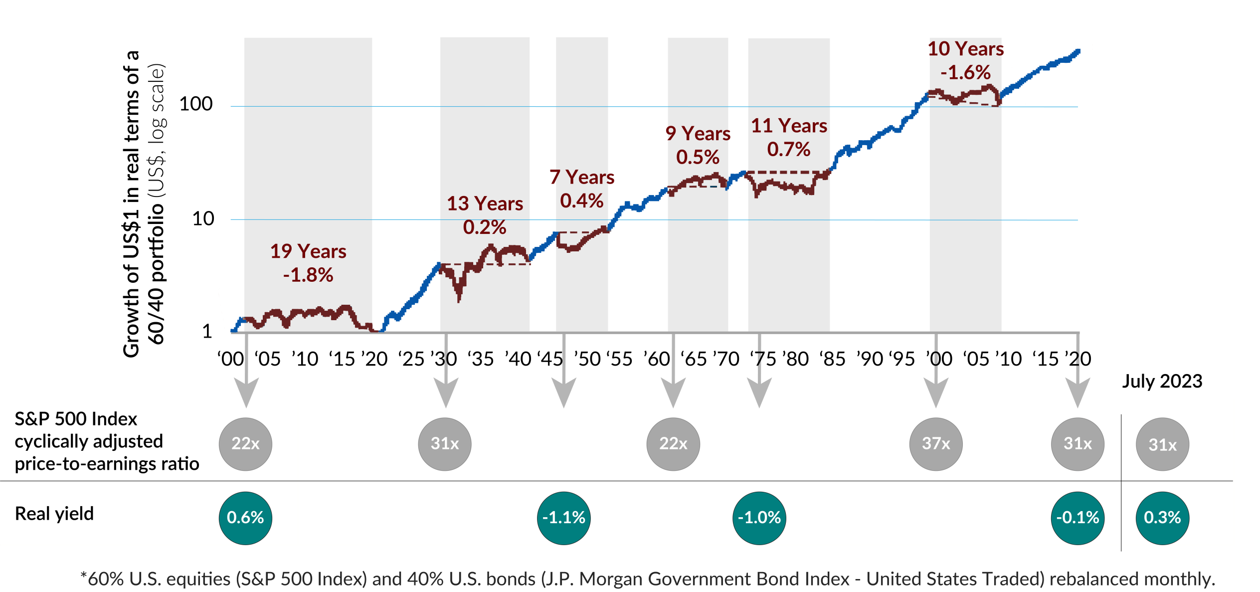
For illustrative purposes only.
Source: GMO Asset Allocation Insights, Tonight We Leave the Party Like It’s 1999, November 2020. Source, July 31, 2023 CAPE: Shiller PE ratio by month, Ycharts.com, https://ycharts.com/indicators/cyclically_adjusted_pe_ratio. Source, July 31, 2023 real yield: 10-Year Treasury Constant Maturity Rate, Federal Reserve Bank of St. Louis, https://fred.stlouisfed.org/series/DGS10. As at September 30, 2023, July 2023 is the most-recent available data. CAPE is the Cyclically adjusted price-to-earnings ratio. Real yields are 10-year U.S. Treasuries minus the 12-month trailing Consumer Price Index. The S&P 500 Index is a broad-based market-capitalization-weighted index of 500 of the largest and most widely held U.S. stocks. The J.P. Morgan Government Bond Index – United States Traded seeks to track government bond fixed-rate issues from the United States. The indexes are not investible.
Losing the popularity contest
This is the opportunity that we are seeing and investing in accordingly. The following table compares the weighted-average market cap in Cymbria compared to the MSCI World Index. Since we started almost 15 years ago, we’ve never been "smaller” – our weighted-average market cap relative to the MSCI World Index has gone from ~50% to under 10% today. It might be surprising to note that our weighted-average market cap, excluding EdgePoint Wealth Management and our other private companies, is C$45 billion, compared to C$601 billion in the MSCI World.iv
| 2008 | 2009 | 2010 | 2011 | 2012 | 2013 | 2014 | 2015 | 2016 | 2017 | 2018 | 2019 | 2020 | 2021 | 2022 | 2023 YTD |
|---|
If you compare Cymbria to the Global Equity fund category (its likely category based on our investment mandate), again you can see the contrast in market caps in Cymbria relative to the 10 biggest Global Equity funds in terms of size if you exclude its private company and fixed income holdings. Our average size holding of C$45 billion is approximately one-eleventh the size of our peers. What’s interesting is that of the approximately 83,000 publicly traded companies globally, only 28 companies have market caps of C$400 billion or greater. This incredibly narrow sliver of 0.03% (28 divided by 83,000) of the market is where most global funds have chosen to invest, regardless that the biggest companies are trading close to all-time valuation premiums relative to smaller companies. The last time this happened, the large-cap indexes were underwater for the next 13 years, as it took a long time for companies to grow earnings to catch up with their previously over-extended valuations. Inflation was low back then so maybe you could afford to be patient, but unfortunately that’s not the situation we find ourselves in today.
Cymbria weighted-average market cap vs. largest Global Equity category funds (C$B)
A perfect storm?
The current investing environment is very interesting because we’re starting to witness “infrequent” events that all seem to be occurring simultaneously. The return of inflation has caused a dramatic rise in interest rates globally. Over the previous decade, low rates and quantitative easing (a.k.a., money printing) created an “everything bubble.” Interest rates are like gravity – the higher they rise, the greater the downward pull affecting asset values. The future is uncertain and there are many potential outcomes. One scenario is inflation returns to under 2%, interest rates go back to historically low levels, money is free again and all assets go up. Another scenario is inflation is sticky and rates stay higher for a prolonged period, which re-prices all assets to lower values and significant wealth is destroyed at the same time that inflation raises the cost of everything.
Many investors today seem to have made the same bet multiple times. The tickers and names are different, but they’re basically “one-idea” funds – with the two biggest ideas being tech and quality, and with a focus on the largest companies. For things to work out for these investors, they need circumstances to revert to a free-money low-interest-rate environment where everything can go back up. Unfortunately for them, that’s not the current environment.
Bringing an umbrella
As previously mentioned, a lot of different scenarios could play out. We’ve constructed our Portfolios to be diversified by proprietary ideas that try to avoid non-obvious correlations. It helps keep us from getting drenched when markets turn stormy. Our investment discipline goes back over 50 years and has seen all kinds of different market events. Our approach to investing in undervalued ideas, where we can buy growth and not have to pay for it, has stood the test of time. At EdgePoint, we believe in both the approach and showing our commitment to it. That’s why internal partners have roughly $363 million alongside our end investors.v
The investment approach over time
Dec. 31, 1971 to Sep. 30, 2023
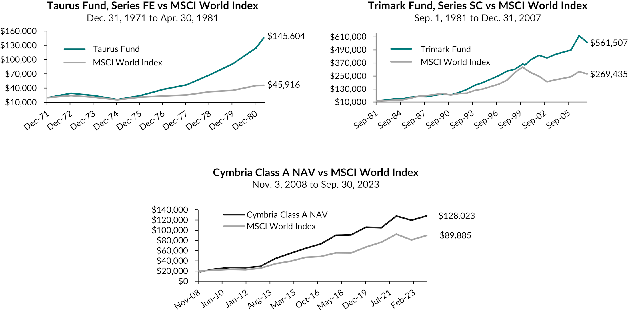
See footnote vi.
Annualized total returns, net of fees, in C$ as at September 30, 2023
Cymbria Corp., Class A NAV - YTD: 7.11%; 1-year: 16.67%; 3-year: 10.36% ; 5-year: 5.17%; 10-year: 12.58% ; Since inception (Nov. 3, 2008 to Sep. 30, 2023): 13.26%. Invesco Global Companies Fund, Series SC - YTD: 7.43%; 1-year: 17.17%; 3-year: 2.96%; 5-year: 2.81%; 10-year: 7.83%; Since inception (Sep. 1, 1981 to Sep. 30, 2023): 10.53%. MSCI World Index - YTD: 10.86%; 1-year: 20.00%; 3-year: 8.52%; 5-year: 8.22%; 10-year: 11.27%; Since inception (Nov. 3, 2008 to Sep. 30, 2023): 10.61%.
As at July 27, 2018, Trimark Fund changed its name to Invesco Global Companies Fund. As at October 17, 2016, Trimark Fund changed its benchmark to the MSCI All Country World Index. Taurus Fund no longer exists and standard performance is unavailable.
Thank you for your continued support. We look forward to hearing what future investors will say about today’s market.